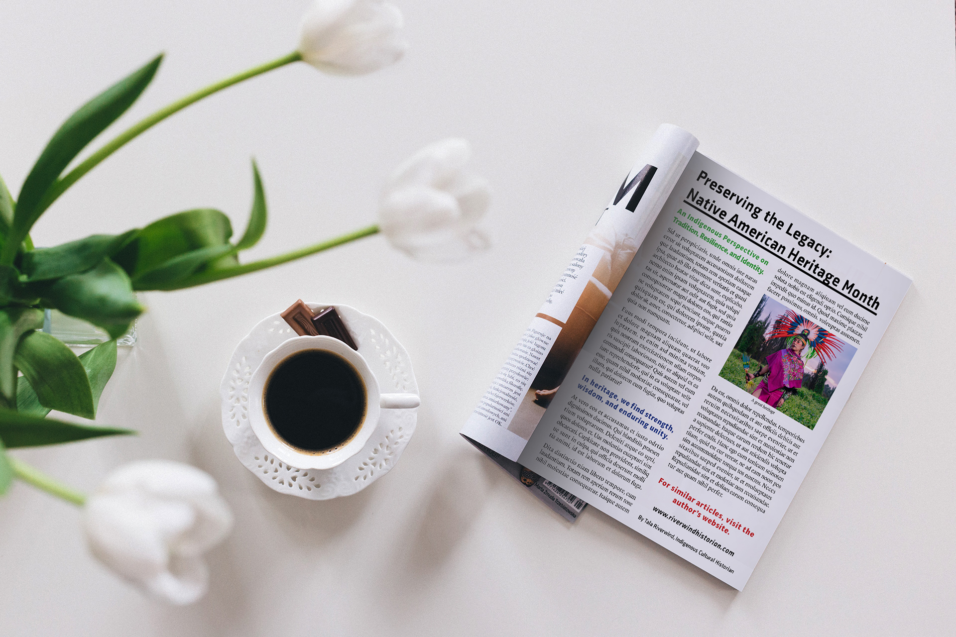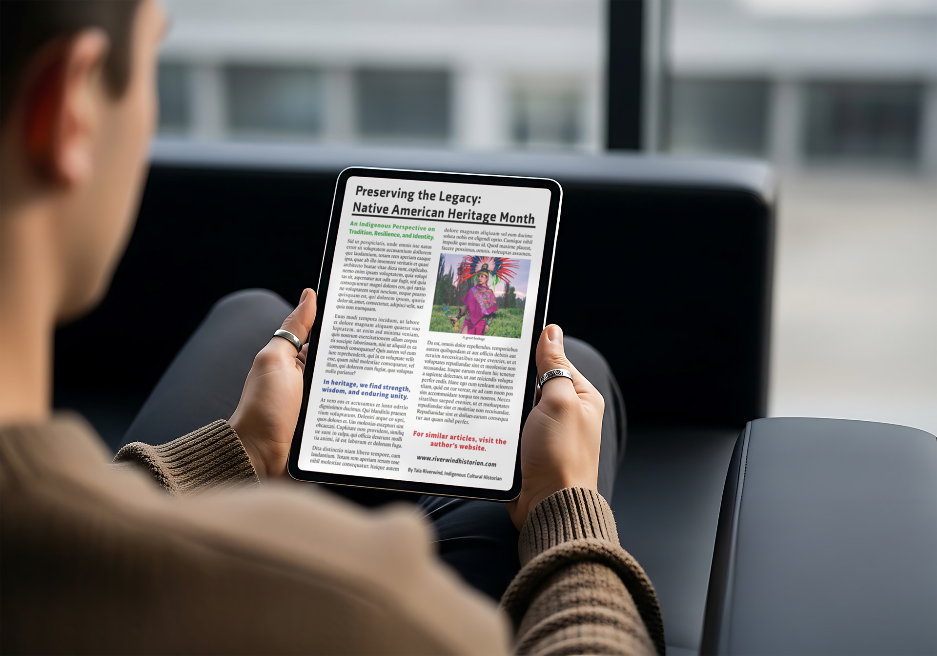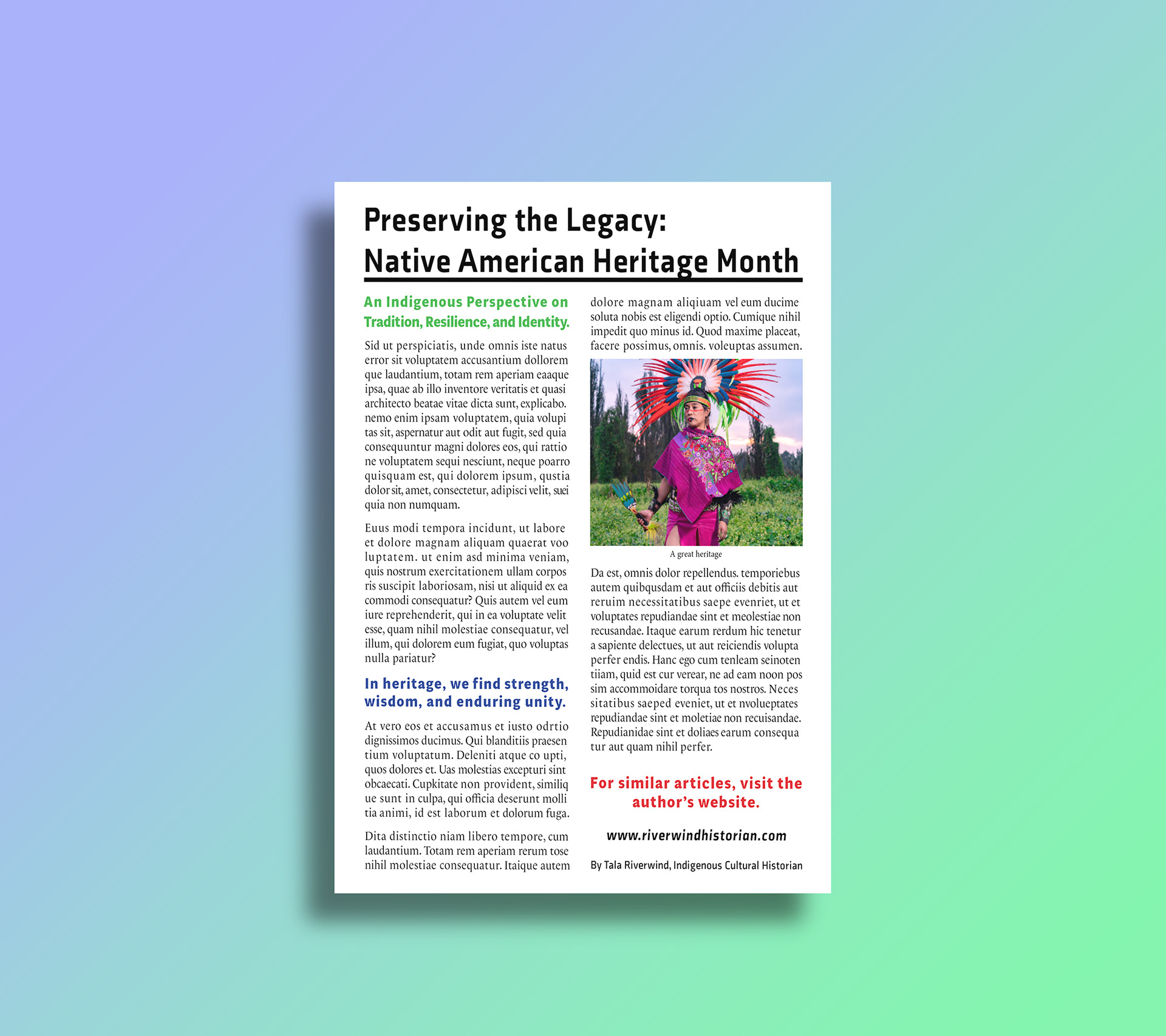
This assignment focused on designing a visually engaging magazine article layout that effectively communicates information through thoughtful typography, visual hierarchy, and page composition.
I selected a photograph that complemented the article's focus on Native American Heritage Month. Using a multi-column grid, thoughtfully organized typography, and strategic use of color, I created a clear visual hierarchy that enhances readability while drawing attention to the featured content. The carefully chosen photograph reinforces the article's message and adds visual interest, creating a balanced and cohesive editorial design.
Throughout the design process, I focused on balancing text and imagery, maintaining consistent spacing and alignment, and guiding the reader naturally through the page. The finished layout demonstrates an informative and visually appealing magazine article.